A homeowner with a leaking sink wants it fixed, not a list of strangers to vet. So I designed a product that finds the one pro they can trust.
At FixerUp, an AI-powered home repair marketplace, I was the sole designer across the user app and the website (desktop and mobile web). I took it from an ambiguous concept to a shipped, high-fidelity beta in about 1 month, and the core of the work was one decision i.e to replace the usual browse-and-compare marketplace with a single, trustworthy AI match.
Jump to the Main Screens or Design System.


THE BET
Every home-services marketplace works the same way, search, browse pros, compare profiles, read reviews, message a few, wait for quotes, decide. That is a shopping task, and it lands on someone at the exact moment they have the least patience for one, because something is broken and they are stressed.
FixerUp's bet was to remove the list. The AI does the vetting and presents one matched pro. My whole job became earning, inside that single match, the trust a list normally asks the user to build for themselves.
PROJECT SPECS
Role: UI/UX Designer (sole designer)
Duration: April 2026 - Present
Platform: Mobile (iOS, Android) and dual-sided marketing web
Team: 3 Founders (CEO, COO, CTO), Engineering team
Tools: Figma, Claude Design, Claude, Adobe Express, CapCut, RunwayML, Krea AI, Notion
NUMBER STORIES
3 Mins
Instant quotes
The average time the AI takes to turn a described problem into an avg. quote.
65
Different Design States
Designed for the project and quote elements, so the app always shows where a job stands.
~1 month
Zero to beta
From an ambiguous AI built concept to a shipped, high-fidelity beta, as the sole designer.
03
Tiers for each User
Service tiers designed for the three user segments the research uncovered.


I grounded the design in three inputs:
Competitive teardown
I pulled apart the incumbent marketplaces (the Thumbtack and Taskrabbit pattern) to locate exactly where the journey adds stress, the compare-and-vet middle is where anxious users stall.
Founder and domain insight
Close, fast loops with the founders to pressure-test the single-match bet against how repair jobs actually get booked.
Segmentation data
The signal that users split into distinct groups with different budgets and service expectations, which became the basis for the three-tier model.
User Interviews
I interviewed 6 participants who had recently dealt with a home repair, a mix of renters and owners. They didn't behave like one audience. Three needs-based segments emerged, and they map directly onto the three service tiers I later designed, which is why the journey forks at stage 4 in the User Journey Map.
Tier 1 — Cost-first fixer (budget-conscious renters and owners)
"I just need it fixed without getting ripped off, I don't need anything fancy."
-
Price anxiety and a real fear of being overcharged
-
Wants the cheapest reliable option, and will wait to save
Tier 2 — Balanced homeowner (the default)
"I want someone good and fair, I just don't have time to vet ten people."
-
Decision fatigue from comparing pros
-
Wants a trustworthy default without overpaying
Tier 3 — Convenience-first owner (time-poor professionals)
"Just send someone great today, I'll pay to have it handled."
-
Values speed and white-glove service over price
-
Wants minimal involvement and high reliability

COMPONENTS AND CRAFT
With a tight timeline, I prioritized foundations over a full design system. I established the typographic and iconographic systems, set the brand, and built a component library with variants for each app screen, so the UI stayed consistent and quick to assemble even without a complete tokenized system.
I designed against Apple HIG and Material, and I'm deliberate about where iOS and Android diverge (navigation and back behavior, native controls, touch targets, type). Components included the AI chat and its states, the match card, the tier selector, job tracking, category cards as custom SVG illustrations, and the truck map icons.


MAIN SCREENS
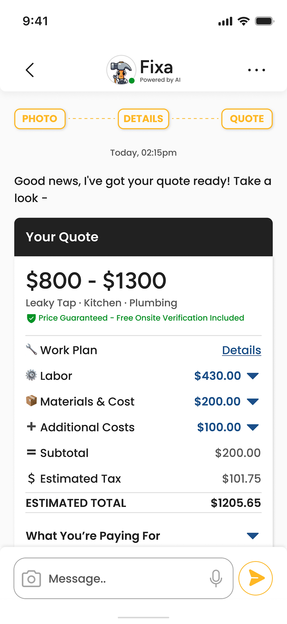
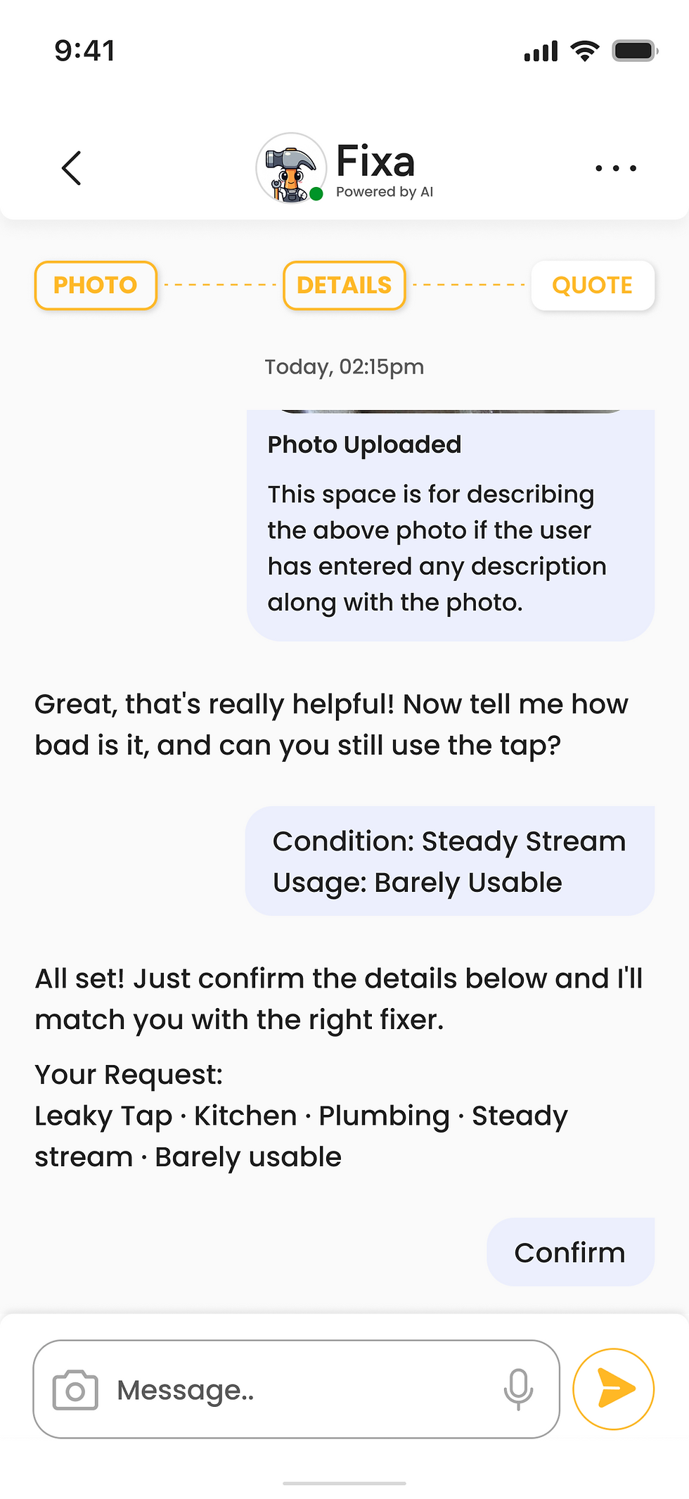
I developed one core solution: an AI-assisted booking flow that matched each homeowner to a single vetted pro and a tiered quote instead of a list to browse, and a human-in-the-loop model that kept users in control, showing the match's reasoning and letting them chat with the fixer, accept a free inspection when the AI couldn't confidently quote, or cancel and re-book free within 24 hours.
As the sole designer, I shipped the core app surfaces end to end:
-
AI chat - The conversational intake that turns a vague "my sink is leaking" into a structured, quotable job, and sets expectations for an AI product from the first tap.
-
Home screen - The home base that gives a returning user a clear read on their active jobs and a fast way to start a new one.
-
Project scheduling - Where the homeowner locks in a time with their matched fixer, turning the decision into a committed booking.
-
Project and quote elements - The most state-heavy part of the app, 65 states covering every status a job and its quote can move through, so the interface always reflects exactly where things stand.
-
Messaging - A direct line to the matched fixer, so questions get answered without leaving the app or losing the thread.
-
User profile - Where the homeowner manages their account details and job history, the layer that makes repeat bookings effortless.




THE MARKETING SITE
Beyond the app, I designed the dual-sided marketing site, with separate entry paths for the two audiences it speaks to, a Fluid Glass-inspired hero, and the stats, USP, and about sections. I made the path from web to app deliberately single: QR-code CTAs rather than scattered download buttons, so acquisition stayed focused. Designing the app and its front door together is what kept the 0-to-1 feeling like one coherent product.
MY LEARNING
Early on I leaned too hard into motion, the mascot and the splash screen, and learned to ease off. At the moments that need trust, motion should help people understand, not just look good. The harder challenge was proving the single-match idea worked with no users yet. I couldn't test my way to confidence, so I built trust into the product itself, with clear states and easy ways out, instead of claiming the bet was proven.
Next up is Voodies II. Previous project NomadNest.