Stomach growling?
Let’s find a meal that makes your eyes and taste buds say yes!
Finding the perfect place to eat can often feel overwhelming! Why though? Endless lists, conflicting reviews, and a lack of real-time experience. Voodies reimagines food discovery by combining short-form videos, real reviews, and influencer insights into a seamless experience helping users make confident dining decisions through engaging, bite-sized content that brings menus and restaurant vibes to life. We launched on 1st April, 2025!
Jump to the Main Screens or Design System.

OVERVIEW
As the Lead UI/UX Designer at Voodies, I’m shaping product strategy, structuring information architecture, and conducting user research to align the experience with user needs. I’ve developed and scaled the app’s Design System for consistency, shipped key features to improve discovery and decision-making, and presented design decisions to stakeholders.
My end-to-end contributions span wireframing, prototyping, usability testing, and final asset delivery, all aimed at creating a seamless, engaging user experience.
PROJECT SPECS
Role: Lead UI/UX Designer
Duration: February 2025 - Present
Platform: Mobile (iOS, Android)
Team: 5 Developers, 2 UI Designers, Marketing Lead, Branding Lead, Founders.
Tools: Figma, Miro, Notion, JIRA, Adobe Photoshop, Adobe Illustrator, Microsoft Office.
NUMBER STORIES
800+
Downloads
In the first month of Launch
48.4%
Conversion rate
In the first 3 months of Launch
676
Onboarded Restaurants
In Los Angeles and San Diego region
624
Active Users
And increasing
CHALLENGE
How might we cut through the noise of conventional food apps and offer a more trustworthy, immersive way to discover food?
Users needed a platform that didn’t just list options, but brought them to life through visuals, personality, and real voices. At the same time, restaurants needed a compelling space to showcase their vibe, dishes, and story to stand out and attract the right audience.
User Onboarding (B2C)

Restaurant Profile (B2B)


HYPOTHESIS
Users struggle with decision fatigue when choosing where or what to eat. They seek a personalized, visually-driven platform that delivers real recommendations from people like them, tailored to their preferences, dietary needs, and location to make confident, satisfying dining decisions.
Local restaurants and food businesses need a more engaging and authentic way to showcase their offerings and connect with potential customers. By creating dynamic video-based profiles and leveraging real customer reviews, businesses can increase visibility, build trust, and drive foot traffic from a more targeted and informed audience.
Explore the Main Screens and accompanying Design System.


I conducted UX research through desk research, competitive analysis, and user interviews to uncover user needs and identify opportunity areas. The user interviews, in particular, provided deep insight into user behaviors, personal experiences, and the key challenges they face during food discovery.
The first few seconds of onboarding define whether a user stays or drops; clarity, visual appeal, and perceived value must be immediate.
Trust & Familiarity Are Key Early On
-
People hesitate to sign up unless they immediately see what value the app offers and trust the source.
-
Use social proof right away (quotes like "| trust Voodies because..."), influencer faces, and high-quality Ul to make it feel authentic.
-
Highlight the USP in a single scroll: "Discover food through real people, not ads."
Visual Content Encourages Exploration
-
Visual onboarding (image backgrounds and food shots) evokes emotional connection and curiosity.
-
Users quote "Eyes eat first" strongly supports the idea that onboarding should lead with visuals not text-heavy flows.
Personalization Starts with Onboarding
-
Users want tailored feeds based on preferences, mood, or cravings.
-
A quick 2-3 question setup ("What are your food preferences?") during onboarding to start personalizing the experience immediately.
Users trust real, visually engaging recommendations from people like them, and make faster, more confident dining decisions when content is both authentic and immersive.
Trust & Familiarity Are Key Early On
-
People hesitate to sign up unless they immediately see what value the app offers and trust the source.
-
Use social proof right away (quotes like "| trust Voodies because..."), influencer faces, and high-quality Ul to make it feel authentic.
-
Highlight the USP in a single scroll: "Discover food through real people, not ads."
Visual Content Encourages Exploration
-
Visual onboarding (image backgrounds and food shots) evokes emotional connection and curiosity.
-
Users quote "Eyes eat first" strongly supports the idea that onboarding should lead with visuals not text-heavy flows.
Personalization Starts with Onboarding
-
Users want tailored feeds based on preferences, mood, or cravings.
-
A quick 2-3 question setup ("What are your food preferences?") during onboarding to start personalizing the experience immediately.


DESIGN SYSTEM
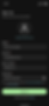
Given the complexity of the app, I designed 50+ screens to support a wide range of features including user onboarding, Business Profiles, and various support flows.
To ensure design consistency and streamline the handoff to developers, I created a modular and tokenized design system built on reusable components and their various states, such as video cards, avatars, progress bars, etc. These components were designed to be flexible, allowing them to be combined and rearranged while preserving a cohesive visual language and familiar interaction patterns for the user.
View the complete Design System here.


.png)

MAIN SCREENS
I developed two core solutions: a seamless user onboarding flow to guide first-time users and an intuitive business profile setup for restaurants to present themselves effectively.
To assess the effectiveness of these solutions, I defined three key evaluation methods. One focused on measuring user engagement and clarity during usability testing, particularly for onboarding. The other two are designed to be measured post-launch, focusing on business adoption and technical performance.
1. User Onboarding (B2C)
-
Simplified Onboarding Flow
Applied Hick’s Law to streamline the decision-making process by reducing the number of onboarding screens, creating a faster and more intuitive experience for first-time users. -
Personalized Experience from the Start
Introduced a preference collection step during onboarding to tailor the user’s video feed with personalized restaurant and cuisine suggestions based on their food interests. -
Built-in Learning with Smart Tooltips
Integrated contextual tooltips throughout the app to guide users through new features and gestures, reducing friction and enhancing ease of use without overwhelming them.
_edited.png)


2. Business Experience (B2B) - 0 to 1
-
Interactive Business Profiles with Video Content
Designed immersive profiles where restaurants can showcase short-form videos highlighting their ambiance, dishes, and behind-the-scenes moments—giving users an authentic preview before visiting. -
Streamlined Profile Setup for Businesses
Created an intuitive flow for restaurants to quickly onboard, upload media, and customize their presence—reducing setup friction and encouraging more sign-ups on the platform. -
Enhanced Discoverability with Visual & Social Cues
Introduced features like profile badges, influencer pins, and categorized video tags that help businesses stand out in user feeds and boost visibility based on aesthetics, popularity, or cuisine type.


USABILITY TESTING
The initial experience wasn’t seamless. The first iteration underwent usability testing, which revealed several pain points and areas for improvement.
User Onboarding
We tested the redesigned sign-in and onboarding screens with 10 users. Each participant completed two core tasks followed by a simplified questionnaire. We evaluated the flow across four criteria:
-
Clarity of purpose
-
Visual engagement
-
Ease of onboarding
-
Likelihood to continue using the app
Results
The new onboarding experience earned an overall rating of 4.6/5, with visual engagement scoring highest at 4.8. Users praised the welcoming tone (“Hey food lover”), clean layout, and consistency with the app’s overall aesthetic.
Ease of use scored 4.4, with users comparing the experience to familiar modern apps—making sign-up feel intuitive and fast. Suggestions included enabling contact syncing and location sharing, and some users still valued features from the older flow like dietary preferences.
Before

After
Making signup easily accessible on the login page streamlines the registration flow.
Well-placed microcopy can encourage users to complete the sign-in process.
The placement creates friction and slows down the registration process.
Remembering a username is often harder for users than recalling their email ID, which is more familiar and consistently used across platforms.
Before

After
Includes a Terms and Conditions checkbox, building trust and ensuring legal compliance—an essential step for onboarding new users responsibly.
Introduces a clear header (“Sign Up”), a profile image placeholder to personalize the experience, and a visually distinct Sign Up CTA that stands out.
Doesn’t display any privacy or terms agreement, which can raise trust issues.
Lacks strong visual anchors. The screen feels sparse and doesn't communicate clear next steps besides a generic "Next" button.
Before

After

Password rules are shown inside a speech-bubble-style box directly under the password input. One password field with a single eye icon toggle
Designed as an all-in-one form to submit everything at once
“Next” feels vague and suggests more tedious steps
Password rules are displayed as plain bullet points above the password fields. Focused only on creating and confirming a password, likely a separate step.
Business Experience
We tested the Business Profile feature using the Voodies beta prototype with 10 participants. Two key tasks were followed by a questionnaire measuring:
-
Intuitiveness
-
Functionality
-
Visual clarity
-
Content relevance
I also captured qualitative insights based on task observations and post-test discussions.
Results
Users found the flow intuitive and familiar, likening it to popular social media platforms. Pinned restaurant videos, visible menus with pricing, and the upcoming bookmark feature were highlights.
The prototype felt smooth and responsive, contributing to overall positive feedback.
Improvement Areas:
-
Users wanted filters for meal types (e.g., breakfast, drinks) for better food discovery.
-
The “info” icon was not easily discoverable, suggesting the need for improved placement.
-
The label “Recommended” lacked clarity; users suggested renaming it to “Other Restaurants Recommend.”
-
There was strong interest in showing open/closed hours directly on restaurant cards.
Before

After
Streamlined and personalized — users can quickly filter by food types.
Overwhelming and inefficient — users have to scroll through all dishes, including ones they can't or don't want to eat
Before

After
The 'Information' button positioned clearly visible, encouraging users to interact with it at the right moment.
Placing the info button far from the related field or label (footer) makes it hard to associate with the content it explains.
Before

After

Using an Info Button to link to a separate page Keeps the main interface clean and task-focused, while still offering detailed help when needed via an info button.
Placing business information on the main page overloads the main page with too much content, making it harder for users to focus on the primary task
MY LEARNING
As an Individual Contributor (IC)
-
Deepened user-centered thinking: By conducting multiple usability test waves and iterating on feedback, I sharpened my ability to design with empathy and clarity, especially during onboarding and content discovery flows.
-
Enhanced UI decision-making: Building a scalable design system helped me understand how component-based thinking supports visual consistency, faster iterations, and clean developer handoff.
-
Iterative problem solving: Working through feedback loops taught me how to prioritize and address both visible usability issues and subtle UX friction points in early-stage prototypes.
As a Project Lead
-
Strategic prioritization: I balanced user needs and business goals by framing hypotheses early and defining success metrics aligned with both B2C and B2B adoption.
-
Collaborative alignment: I facilitated collaboration across design, product, and dev teams by maintaining open feedback channels and ensuring shared understanding through documentation and design systems.
-
Outcome-driven mindset: Defining what success looks like, from click-through behavior to usability satisfaction, helped me steer the team toward measurable, high-impact improvements.
-
Design advocacy: I communicated the value of user research and testing to stakeholders, driving design decisions that aligned with both the product vision and technical constraints.
Next up is Evolutio. Previous project Voodies II.